04
The Typeface
For the structure of the page, I wanted to optimize the users ability to quickly scan information like I have prioritized in the rest of my portfolio.
I implemented a left aligned text rather than center aligned. I did this to avoid the user having to zig zag back and forth with their eyes, making the paragraphs harder to read quickly.

Header Text
For my header text I took inspiration from my favorite font, DIN 1451. DIN 1451 is the font used for German street signs. Essentially Germany's Helvetica.
I am a German citizen, my dad was born there and our family has strong roots there. DIN 1451 for me provides both visual clarity and a sense of nostalgia for me. Familijen Grotesk provides a a similar font with a flair that I was drawn to.

Picking a sans-serif font for headers provides good visual clarity and a font that can be easily made bold without the text being too dense or taking away from it's clarity.
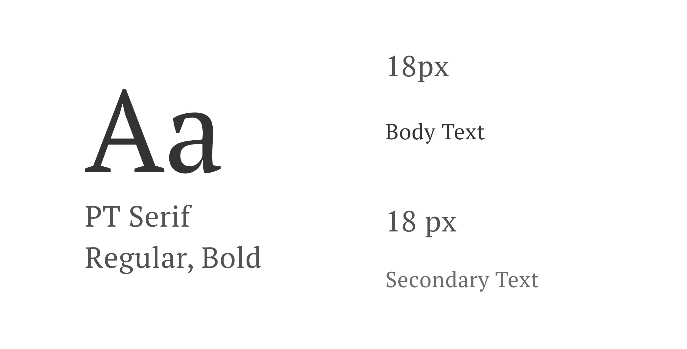
Body Text
In contrast to the modern sans-serif fonts popular in tech companies, I selected a serif font for body text. Inspired by traditional book typography, this choice enhances readability for longer passages, ensuring that users can comfortably engage with extended content.
This approach balances contemporary design trends with the need for extended reading comfort.
By integrating these design principles, my portfolio reflects a balance of user-centered design and personal aesthetic, aimed at delivering a seamless and engaging experience.


